Logo, Packaging and Website
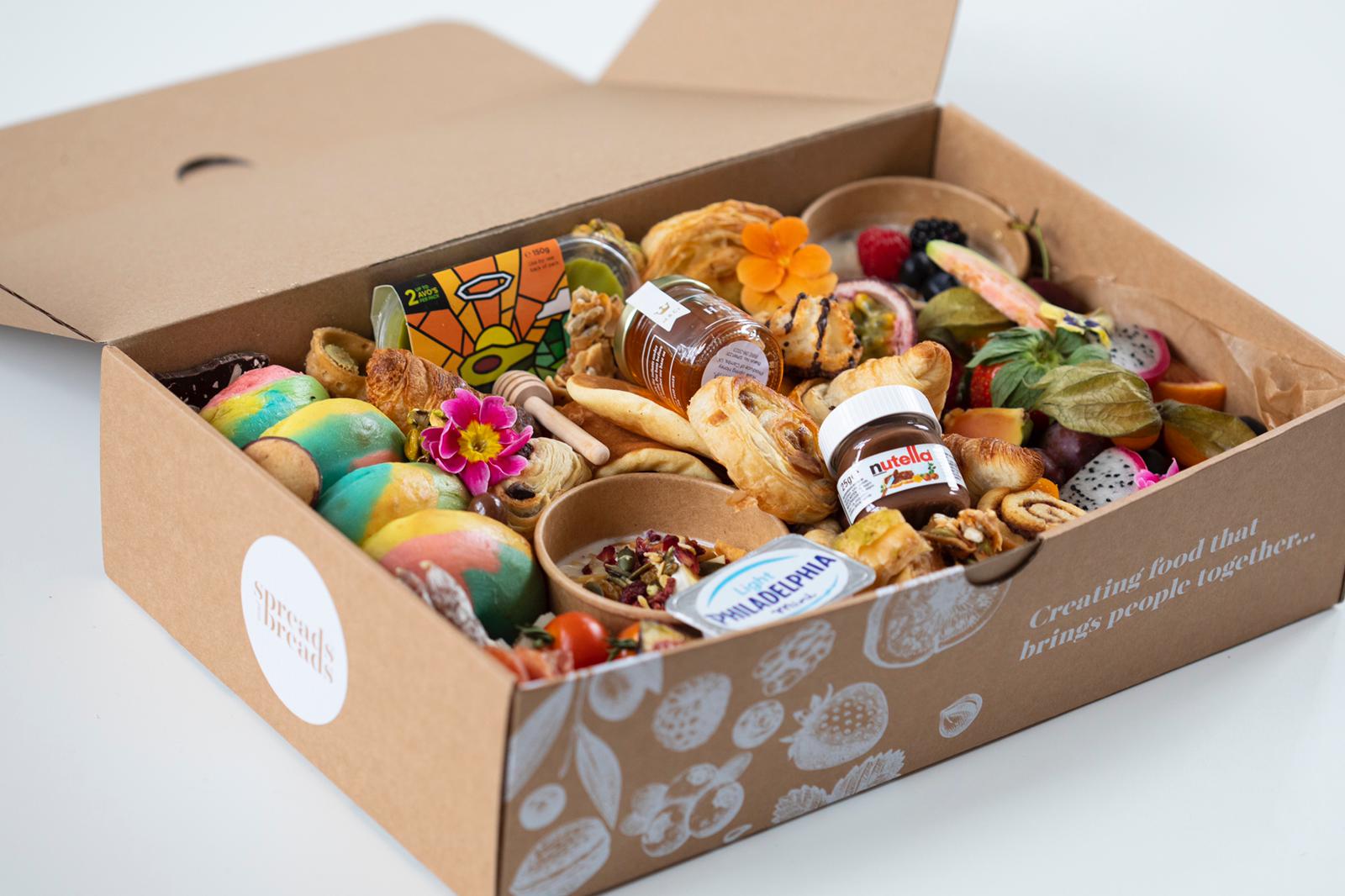
Spreads and Breads brings you social casual dining at its best! The region's first show-stopping Grazing Caterer, creating food that brings people together, creates special memories and Instagram-worthy photos for any celebration.
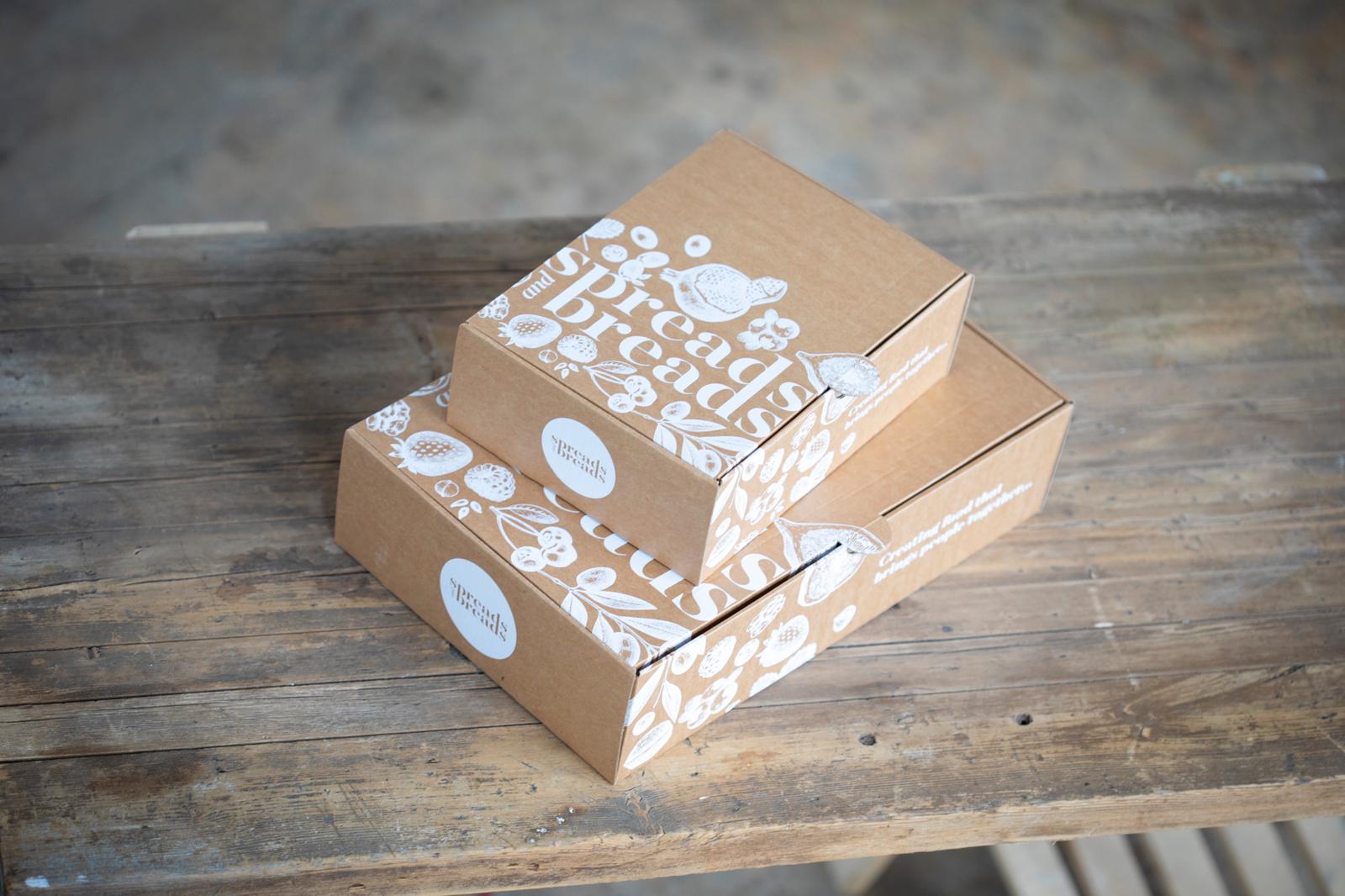
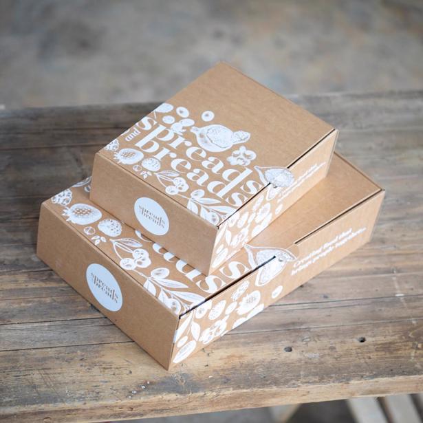
You’d be hard-pressed not to find inspiration from this charming company! They love what they do, and their products look spectacular. That’s why we were so pleased to be chosen to help create their logo, packaging (grazing boxes), and website.
What was involved?
Sarah wanted a brand style that had a premium feel and set them apart as the market leader. The latter being quite important as they were one of the first companies to provide such a service.
Our designer created a clever logo that physically imitates the verb ‘Spread’. The olive green hints at some of their more savory ingredients.
From there we worked with Sarah’s list of elements to create a striking grazing box. Usually, we create the logo, then the website, and then the packaging; but we knew that the packing would help influence the style of the website. The white design, containing fruit and olives contrasts beautifully with the brown background and has a rustic, yet luxurious feel.
Lastly, we created a framework and designed their website (visual, not mechanical in this instance), using their new assets and some of their pictures from Instagram. Nore (Spreads and Bread's talented web developer) used the designs as templates.
We are always happy to work with other professionals to get the job done and, in this instance, our joint backgrounds helped to create something we’re all proud of.
