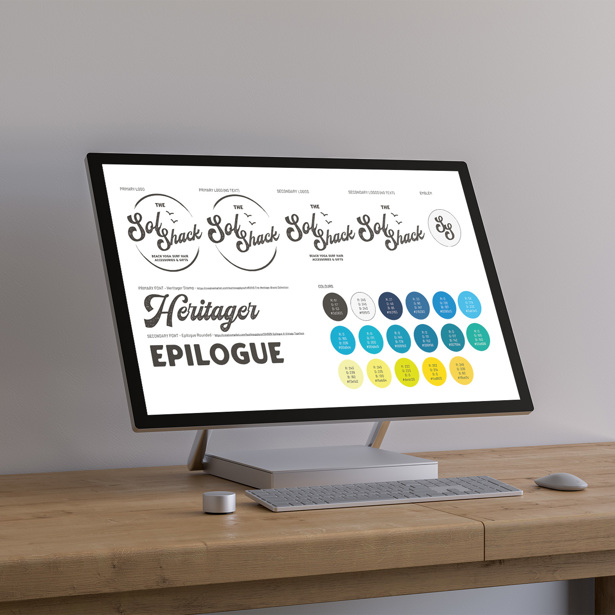
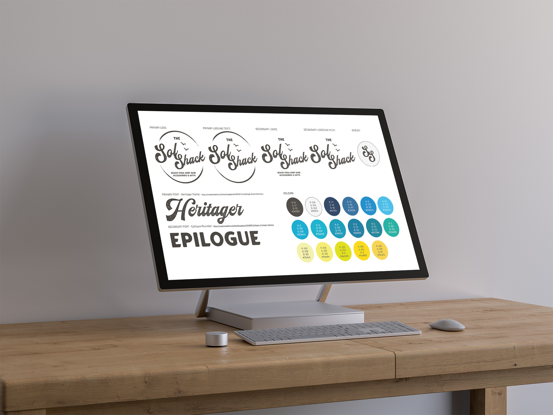
Logo
Sol Shack is a gifts and accessories store for beach, outdoor, nature, and sea lovers. If you’re after something special, Sol Shack will help to inspire you.
What was involved?
Natalie wanted a logo that was cheerful and evoked feelings of being at the seaside. Despite ‘sol’ meaning ‘sun’, it was important to her that the logo was more than just a direct representation of the company name (so no bright yellow circles, with a shed)!
Our designer worked with Natalie to create a suite of seaside colours that could be interchanged, depending on the background and material the logo is displayed on. The font used was fluid in appearance and a texture was applied to give the impression of something that had been sea-worn.
Take a look